Great Design vs. Poor Design: The Power of...
Discover how to create a clear visual hierarchy in UI design to guide users’ attention and improve navigation.
Md Kamrul Hasan
Apr 24, 2025

In design, every choice matters. While anyone can make decisions, only a few make the right ones. The difference between a good designer and a bad one lies in the quality of those decisions. Let’s break down what sets great designers apart and how small choices lead to big outcomes.
1. Defining Great and Poor Designers
Great Designers prioritize users. They:
Conduct user research and build detailed personas.
Base decisions on data, feedback, and user pain points.
Create intuitive, functional designs that solve real problems.
Poor Designers skip the groundwork. They:
Rely on assumptions or personal taste instead of user needs.
Follow trends blindly, creating visually appealing but ineffective designs.
Ignore data, leading to solutions that miss the mark.
2. Decision-Making: The Heart of Design
Every designer starts with a blank canvas. From there, it’s a series of choices — colors, typography, images, layout — that shape the final product. Good designers make deliberate, user-focused decisions, while bad designers make haphazard ones that undermine the experience.
3. From Blank Canvas to Masterpiece (or Mess)
The journey from a blank slate to a finished design hinges on a few critical choices:
Good Design transforms a canvas into a seamless experience through:
Relevant Imagery: High-quality visuals that align with the message.
Harmonious Colors: A cohesive palette that evokes the right mood.
Clear Hierarchy: Logical structure that guides users effortlessly.
Effective Typography: Readable, consistent fonts that enhance clarity.
Bad Design stumbles with poor choices:
Irrelevant Imagery: Low-quality or off-topic visuals that confuse.
Clashing Colors: Jarring palettes that strain the eyes.
Chaotic Hierarchy: Disorganized layouts that frustrate navigation.
Poor Typography: Illegible or inconsistent fonts that disrupt readability.
4. The Impact of a Few Choices
It takes only a handful of decisions to go from blank to brilliant — or disastrous.
To Create Greate Design:
Choose images that tell a story and resonate with the audience.
Use a consistent color scheme that aligns with the brand.
Establish a visual hierarchy that feels intuitive.
Select typography that’s clean and purposeful.
To Create Poor Design:
Pick random, low-quality images that dilute the message.
Use colors that clash or distract from the content.
Ignore hierarchy, leaving users lost in the layout.
Opt for fonts that are hard to read or inconsistent.
5. The Path to Great Design
Becoming a good designer isn’t about mastering tools or chasing trends. It’s about:
Informed Choices: Ground every decision in user needs and data.
Continuous Learning: Stay curious about design principles and user behavior.
Embracing Feedback: Use critiques to refine and elevate your work.
User-Centric Focus: Ensure every element serves the user’s experience.
6. Why It Matters
Great designers don’t just create pretty visuals — they craft experiences that delight and empower users. Bad designers, by contrast, prioritize aesthetics or ego over function, leaving users frustrated. The difference? A commitment to thoughtful, strategic decisions.
Be the designer who makes the right choices. Your work will stand out, not because it’s flashy, but because it’s meaningful.
Image Suggestion
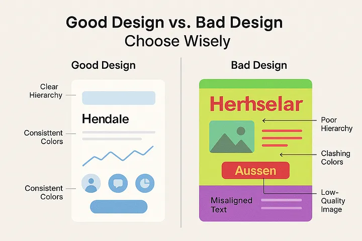
To complement this revised text, the image should visually contrast good and bad design decisions:
Concept: Split the image in half.
Left Side (Good Design): A clean, modern interface with harmonious colors (e.g., soft blues and whites), clear typography, intuitive icons, and a balanced layout. Include subtle annotations like “Clear Hierarchy” or “Consistent Colors” to highlight strengths.
Right Side (Bad Design): A chaotic interface with clashing colors (e.g., neon green and red), misaligned text, low-quality images, and cluttered elements. Add annotations like “Poor Hierarchy” or “Clashing Colors” to emphasize flaws.
Style: Minimalist and professional, with a focus on clarity. Use a neutral background to keep the focus on the design elements.
Text Overlay: A bold, centered headline like “Good Design vs. Bad Design: Choose Wisely” in a clean, sans-serif font.
This visual would reinforce the text’s message, making the contrast between good and bad design instantly clear and memorable.